

Finance

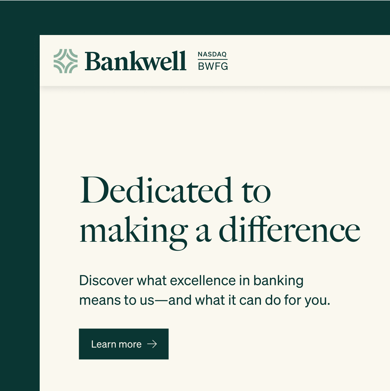
Bankwell has a powerful combination of close service and sophisticated solutions delivered quickly that other institutions struggle to achieve. Long trusted by major New York-based businesses and local Connecticut residents, Bankwell aimed for national growth through modern, digital-first solutions for small and medium-sized businesses. It needed a brand that could elevate the experience for its loyal audience while welcoming new ones. We created a vision that strikes the right balance between sophisticated and approachable—just like Bankwell.


Vintage editorial illustrations use vector styling and warm colors to create a sense of trust without feeling clinical. Each illustration has slight noise and a subtle orange overlay filter to soften the formality of finance while still communicating professionalism.

We used two typefaces to hit a refined and of-the-moment note. Big Caslon Regular creates an elegant and editorial feel in headers and titles. Söhne brings a modern clarity to everything else.
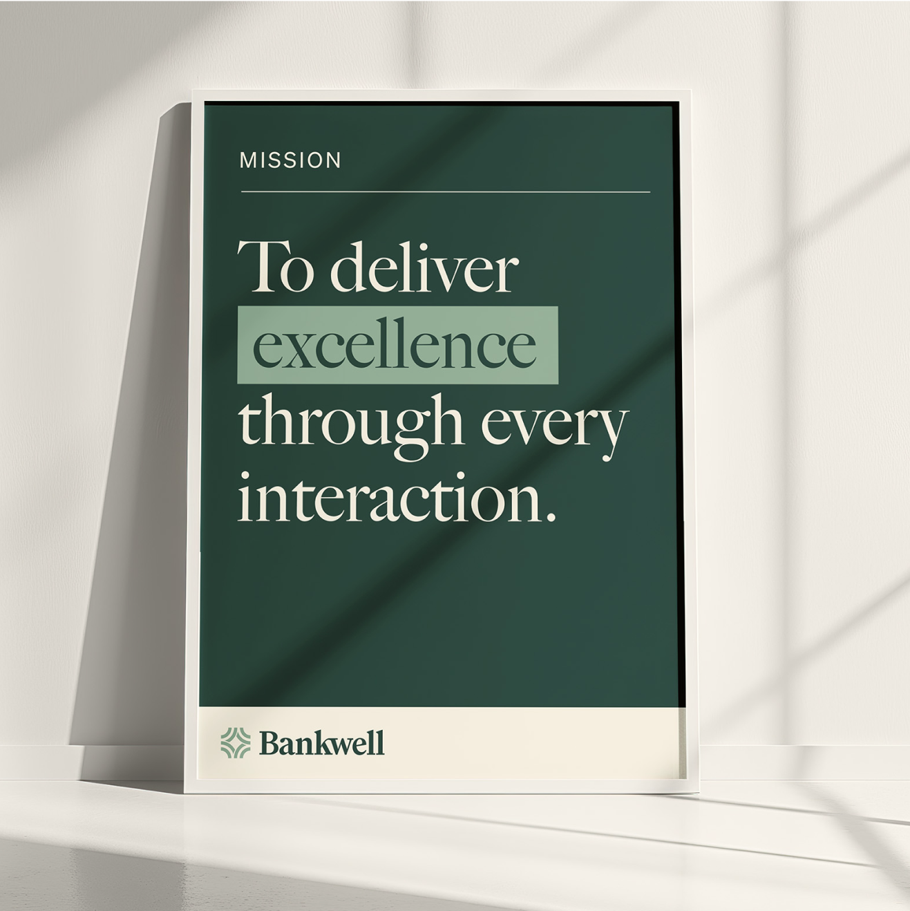
We equipped Bankwell with a clear, purposeful mission statement that distills what has always set them apart and will continue to guide their growth. It’s simple and it’s true, giving their team a shared standard to align around and a way to measure their impact across every department.
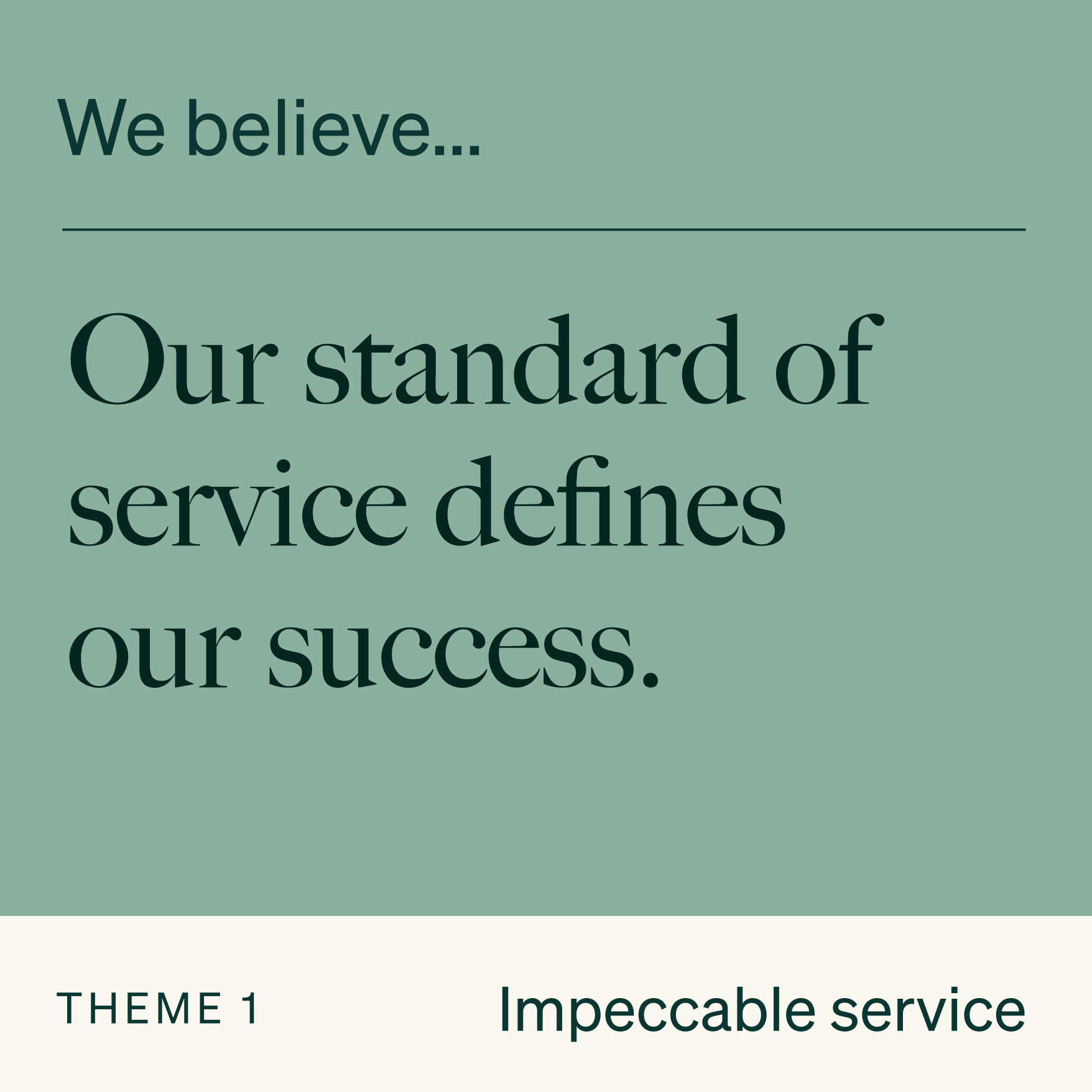
A taste of the messaging framework we created using insights we gathered from the team, covering Bankwell’s purpose, process, and outcomes across four essential themes. Taken together, it gives them a clear narrative structure to discuss where they’re going, why it matters, and how they’ll get there.


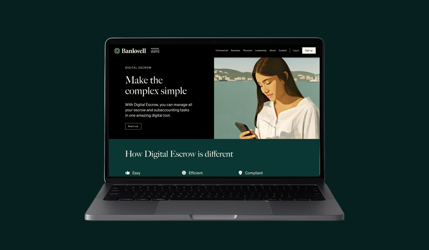

A glimpse of the complete website overhaul including core pages and product pages, informed by interviews with their banking teams. We used a modular approach to keep things clean and modern and different color systems to speak to each audience.


