

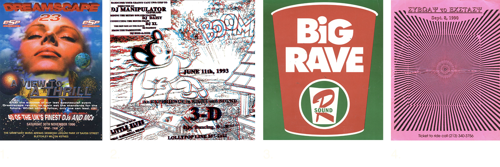
1. Junior Tomlin, 1996 2. Artist unknown, 1993 From Ernie Villalobos rave flyer archive 3. Artist unknown, year unkown, From Ernie Villalobos rave flyer archive 4. Artist unknown,1990, From Ernie Villalobos rave flyer archive
When’s the last time someone handed you a flyer that was a little weird, a little beautiful, and promised a transcendent night of dancing in a secret, dingy warehouse? Probably not since the ’90s. These days, most event invites are digital, and physical posters are more collector’s items than essential guides. Plus, those warehouses were bulldozed to make room for luxury high-rises.
Today, we’re taking a close look at the history and visual language of ‘90s rave flyers—a scene where music, rebellion, and design met up. So don your phat pants and beaded bracelets, slam a Red Bull, and tell mom you’re just going to Rachel’s for a sleepover. It’s time to dance.
Let’s consider their design approach. Like any design project, rave flyers served a practical purpose. But unlike modern graphic design, the rules were quite different. Instead of polished grids and clean hierarchies, these flyers were designed to communicate a vibe. This allowed creators to break traditional invitation design conventions and create weird, wild, and eye-catching pieces of physical media. At the same time, because these parties were often illegal and held in abandoned buildings or hard-to-find venues, promoters had to avoid attracting the wrong attention—police, nosy neighbors, or anyone who might shut things down. Rave flyers inverted the classic “who, what, when, where” poster formula.
These flyers weren’t made for clients. Their only job was to draw in people who loved great beats and a great time. They leaned more towards art than traditional design, showing how fewer rules meant more room to get weird. And fewer eyes meant more freedom to rip intellectual property—think Mickey Mouse and Tide laundry detergent—without much risk of being sued. Sometimes low distribution is a very good thing, serving to protect the community and preserve its aesthetics.
Their visual language spoke directly to the in-crowd: saturated neon palettes, geometric patterns, and the ever-present smiley face (one that happened to match a certain type of tablet, if you catch our drift). Similar to the psychedelic visual elements that dominated ‘70s subcultures, ‘90s rave flyers made ample if-you-know-you-know visual references to tripping on drugs. Interestingly, as Emily Gosling points out, there’s scientific justification for why psychedelic signifiers last across generations: “In 1926, German and American psychologist Heinrich Klüver studied the effects of hallucinogenic substances on users, and noted that the visuals they experienced were often recurring geometric patterns—dubbed “form constants”—in “highly saturated colors.“
Top-secret raves and the flyers that introduced them are a thing of the past, but we still see their influence today. What’s regarded as “cool design” naturally shifts over time, and for the past ten years, it’s been anything reminiscent of the ‘90s rave scene. Like how some brands temporarily adopted anti-design visual elements a few years back, we’re seeing the commercialization of rave scene aesthetics. You’ll spot rave fonts and color palettes promoting events as big as the Olympics. Clubs borrow similar visual elements to publicly promote DJ gigs on Instagram. EDM festivals are a major business.
Don’t be sad that you may not get the chance to experience storming a dilapidated building and staying up way past your bedtime. Instead, let’s consider how we might honor this moment in time in our own work by breaking conventions and doing something unexpected. Ask yourself what it looks like to prioritize beauty over clarity, so that a small group of people feel seen and understood. Look here for a bit of inspiration.
Sources:

